Introduction:
Before moving to the media query, we need to understand the following terms.
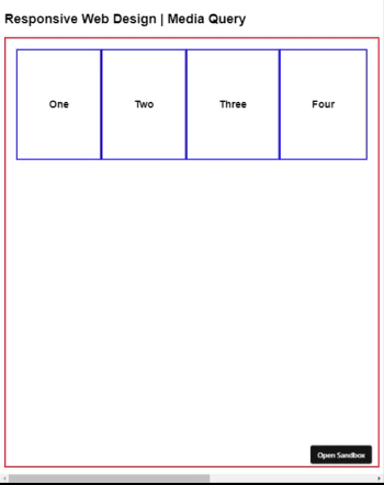
1. What is Responsive Web Design?
A web page can be viewed on desktops, tablets, and phones. Responsive web design is the backbone to make a web page adaptive to all the devices.
A responsive web page looks good on all the devices. It adapts its content to fit on all the devices. To make a web page responsive, you use CSS and HTML to modify its content.
2. What is The Viewport?
It is the user’s visible area of the browser’s window. Its size varies as the screen’s size varies, so it will be smaller on mobile devices and bigger on computer devices.
You need to add a “meta tag” on your web page to take control over the viewport. This tag was firstly introduced by Apple in Safari iOS.
<meta name=”viewport” content=”width=device-width, initial-scale=1.0″>
By adding the above meta tag, you are telling the browser how to control the viewport’s size and scale.
Viewport meta tag properties:
- width=device-width: “device-width” is the screen width of the device. It sets the width of the web page. You can set the width to a specific number like width=600px.
- height=device-height: “device-height” is the screen height of the device.
- initial-scale=1.0: It controls the initial zoom level of a web page when the page is first loaded.
- minimum-scale: Minimum zoom level of a web page.
- maximum-scale: Maximum zoom level of a web page.
Media Query:
A media query is a popular technique to make a web page responsive. It was introduced in CSS3. You can control the behavior of the DOM element on different devices and screen sizes by using the media query.
Media Query Syntex:
@media not|only mediatype and (mediafeature and|or|not mediafeature) {
CSS-Code;
}
The @media rule is used to apply different styles on different devices and screen sizes.
Operators:
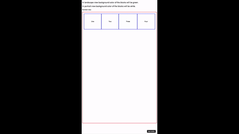
- not: it is used to negate the media query.
@media not screen and (orientation: portrait) {
.landscape { display: block; }
.portrait { display: none; }
.flex-container > .flex-item { background-color: green; }
}
The above media query describes that background color green will not be applicable for portrait view.
- only: Styling will be applied only when all the written conditions are fulfilled. It prevents the older browser to apply the selected style.
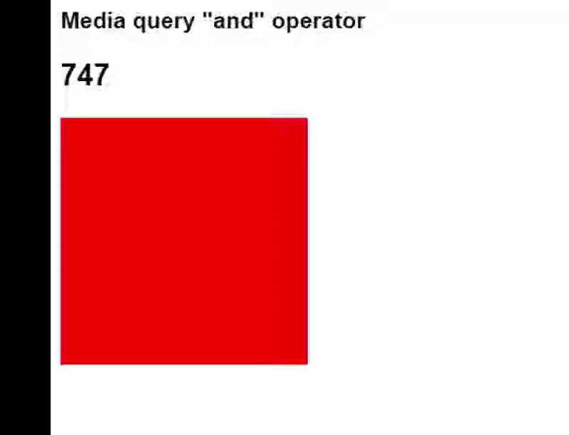
- and: it is used for combining a media feature with other media features or media types.
Example:
.container > .item {
background-color: red;
}
@media screen and (min-width: 768px) and (max-width: 800px) {
.container > .item {
background-color: green;
}
}
@media screen and (min-width: 801px) {
.container > .item {
background-color: blue;
}
}
Following is the example of the and operator.
Background color of the block will be vary on the basis of width;
Media Types:
Using mediatype users can define the category of the device on which styling will get applied. it is an optional property.
- all: It is the default value. It is used for all devices.
@media all and (min-width: 320px) and (max-width: 479px) {
body { background-color: green;}
}
- print: It will make styling applicable only on printing devices.
@media print and (min-width: 320px) and (max-width: 479px) {
body { background-color: green;}
}
- screen: It is used for computers, tablets, and mobile devices
@media screen and (min-width: 320px) and (max-width: 479px) {
body { background-color: green;}
}
- speech: It is used for screenreaders, i.e. devices that use assistive technologies.
@media speech and (min-width: 320px) and (max-width: 479px) {
body { background-color: green;}
}